Scientific Visualization
Results for "scientific visualization"
 Status: Preview
National Taiwan University
Skills you'll gain: Experimentation, Physics, Medical Imaging, Engineering, Scientific, and Technical Instruments, Mathematical Modeling, Physical Science, Scientific Methods, Applied Mathematics, Scientific Visualization
 Status: Free Trial
University of Colorado Boulder
Skills you'll gain: Interactive Learning, Education Software and Technology, Design Strategies, Mathematics Education, Pedagogy, Simulation and Simulation Software, Simulations, Interactive Design, Experimentation, User Feedback, Scientific Visualization, Chemistry, Display Devices, Graphing, Physics, Biology, Algebra, Geometry
 Status: Free Trial
Johns Hopkins University
Skills you'll gain: Magnetic Resonance Imaging, Medical Imaging, Image Analysis, Data Manipulation, Neurology, R Programming, Radiology, Data Processing, Scientific Visualization, Data Import/Export
Most popular
 Status: Preview
University of Arizona
 Status: Free Trial
University of Toronto
 Status: Preview
The University of Tokyo
 Status: Free Trial
Rice University
Trending now
 Status: Free Trial
University of Michigan
 Status: Preview
King Abdullah University of Science and Technology
 Status: Free Trial
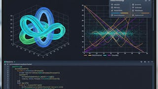
MathWorks
- Status: Free Trial
University of Toronto
New releases
 Status: Free Trial
 Status: Free Trial
 Status: Free Trial
 Status: Free Trial


